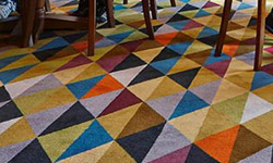
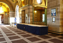
In Stock and On Stream
Key price, quick turnaround carpets, all constructed in industry gold-standard 80% wool, 20% nylon yarn.
Ready to Weave
Expansive designs ready in 4 weeks. These collections are recolourable within our stock palettes
Tufted
Key price, quick turnaround carpets, all constructed in industry gold-standard 80% wool, 20% nylon yarn.
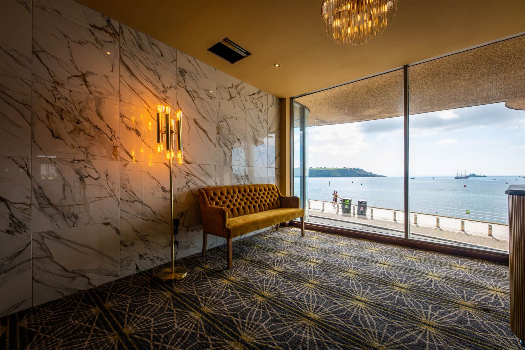
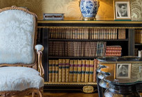
Bespoke Carpet
Work with our studio to create a unique carpet to your exact brief with custom colours and quality
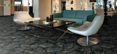
Vignette Rugs
Contemporary, commercial rugs woven in enduring axminster.
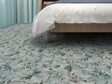
Kit Kemp Hand Tufted Rugs
Exquisite quality, 100% wool, hand-tufted rugs in a suite of boho-chic designs.


In Stock and On Stream
Key price, quick turnaround carpets, all constructed in industry gold-standard 80% wool, 20% nylon yarn.
Ready to Weave
Expansive designs ready in 4 weeks. These collections are recolourable within our stock palettes
Bespoke Carpet
Work with our studio to create a unique carpet to your exact brief with custom colours and quality
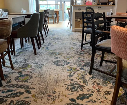
Printed Carpet
Printing the design onto the carpet offers a wealth of opportunity for refined, large-scale design, keenly priced for guest bedrooms and other lower-traffic areas.
Vignette Rugs
Contemporary, commercial rugs woven in enduring axminster.
Kit Kemp Hand Tufted Rugs
Exquisite quality, 100% wool, hand-tufted rugs in a suite of boho-chic designs.

We’re currently loving… greige
- Blog


Picking up on the interiors trend away from cooler colours to a warmer palette, our new standard colour bank, Serenity features several shades in the greige space.
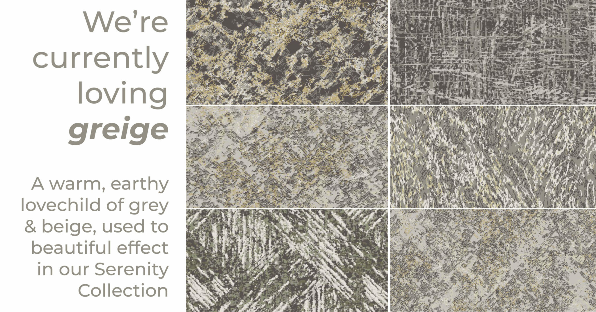
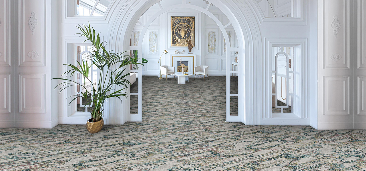
For the longest time we had beige as our base tone; warm, soft and meh. It was replaced for 2 decades by everything grey, from battleship to French. Of late, interior trends are leaning into a compromise colour, a meeting of their best assets; greige. Warmer than grey, but with it’s sophistication. A neutral with base notes of violet, magenta or even moss-green. It features heavily in our new palette Serenity and the subsequent first collection to spring out of that palette; Book 1.
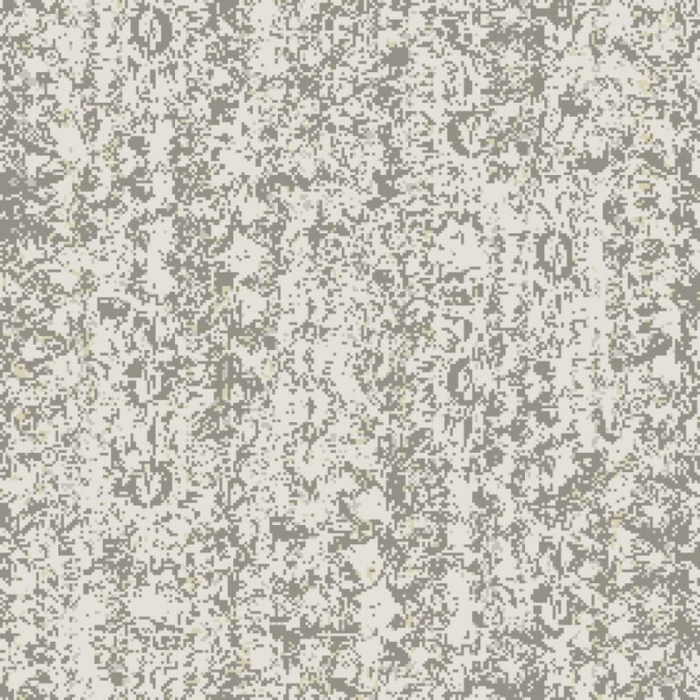
At the lightest end of the scale are designs like this delicate textural offering which leans heavily on the colour we’ve called Porcelain. Perfect in guest bedrooms, upper floor corridors and spaces which need to maximise their natural light and space.
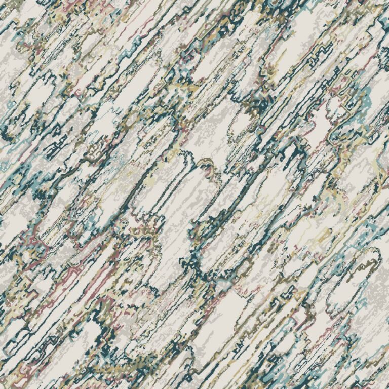
Using those light touch tones but with a real sense of fun, thanks to the introduction of pops of pastel is this gorgeous design. The pattern has a geological element; making it look like a whimsical marble. Strawberry Fool pink, and Topaz blue as well as our Goldfinch yellow provide a ‘forever summer’ vibe with this design.
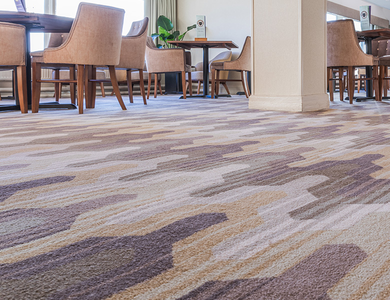
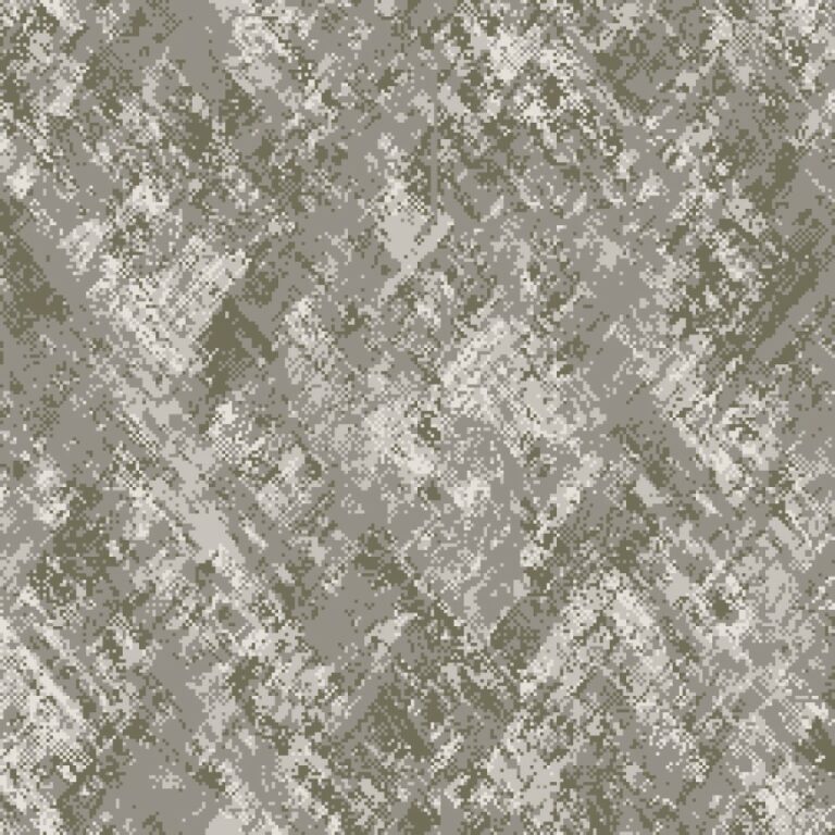
Back with the textural element, this design takes our neutral base into the taupe zone. Earthy greens offer an organic tranquility thanks to the colours Wold and Eucalyptus. Deeper in tone, this is a really usable colourway as well as a chic choice.
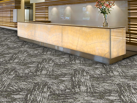
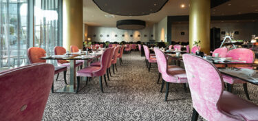
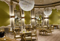
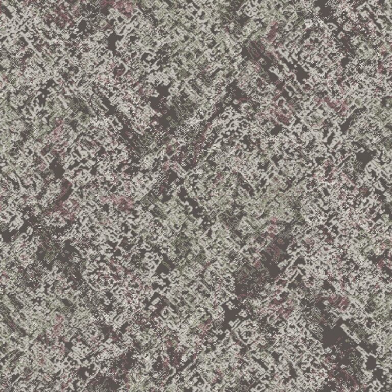
More practical on the greige scale, and designed for heavier traffic zones with maximum soil-hiding capabilities are the Slate-based designs like this one which combines a mossy green, hints of magenta and a deep purple-grey ground for busy bars, restaurants and a warm reception.
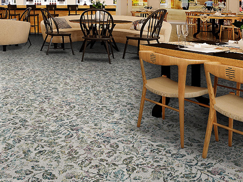
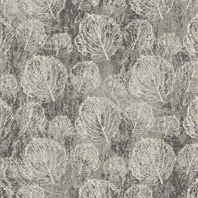
Firmly back in neutral territory is this sweet mid-scale design, featuring a leaf skeleton, or petiole. The delicate texture of the foliage, combined with the distressed ground make this a timeless design which we think will look glorious in dining spaces, conference suites and function rooms.
All of these designs come in a variety of colourways so explore the full collection so see what other greige-based design joy we’ve offered in this collection. But if we’ve not quite hit the nail on the head in terms of the hues, this collection is part of out Ready to Weave offer, meaning you can recolour all of the designs within any of our 3 standard palettes at no extra cost. Click on the link in the text to take you to the design, and have a play with our semi-bespoke online tool.
Or just get in touch and we’ll listen to your priorities and help deliver them.