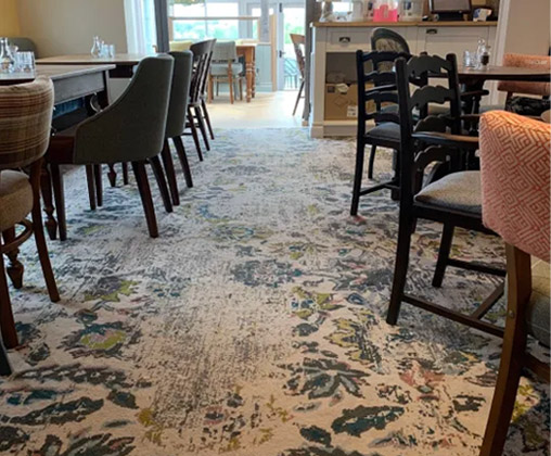
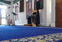
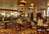
In Stock and On Stream
Key price, quick turnaround carpets, all constructed in industry gold-standard 80% wool, 20% nylon yarn.
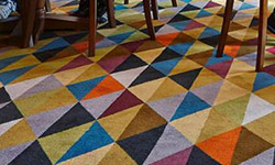
Ready to Weave
Expansive designs ready in 4 weeks. These collections are recolourable within our stock palettes
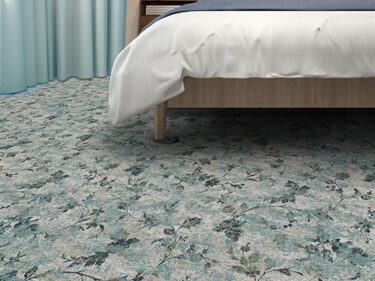
Tufted
Key price, quick turnaround carpets, all constructed in industry gold-standard 80% wool, 20% nylon yarn.
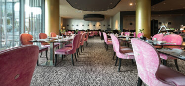
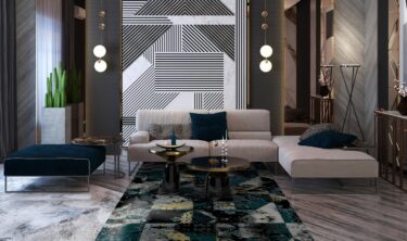
Bespoke Carpet
Work with our studio to create a unique carpet to your exact brief with custom colours and quality
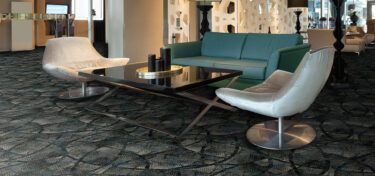
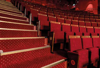
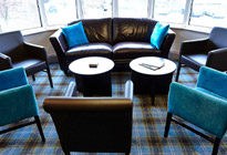
Vignette Rugs
Contemporary, commercial rugs woven in enduring axminster.
Kit Kemp Hand Tufted Rugs
Exquisite quality, 100% wool, hand-tufted rugs in a suite of boho-chic designs.


In Stock and On Stream
Key price, quick turnaround carpets, all constructed in industry gold-standard 80% wool, 20% nylon yarn.
Ready to Weave
Expansive designs ready in 4 weeks. These collections are recolourable within our stock palettes
Bespoke Carpet
Work with our studio to create a unique carpet to your exact brief with custom colours and quality
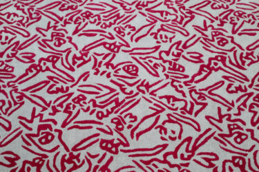
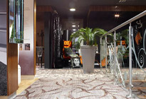
Printed Carpet
Printing the design onto the carpet offers a wealth of opportunity for refined, large-scale design, keenly priced for guest bedrooms and other lower-traffic areas.
Vignette Rugs
Contemporary, commercial rugs woven in enduring axminster.
Kit Kemp Hand Tufted Rugs
Exquisite quality, 100% wool, hand-tufted rugs in a suite of boho-chic designs.

Introducing Our New Stock Palette, Serenity
- Featured


What’s the purpose of a stock palette?
Stock palettes are those banks of 12 colours, permanently on loom which allow us to create a suite of stock designs and colourways which can be woven quickly and cost-effectively. Joining the perennially successful Dimensions, which offers rich colours, perfectly suited to classic designs and more traditional settings; and Creations, developed firmly with hospitality spaces in mind, combining enduring greys with popping jewel tones, our new palette Serenity brings together commercial practicality with contemporary sophistication and future-proofed colourfields, ensuring your designs will stay current for the lifespan of the carpet.

Creativity grounded in research
Originating this new colour landscape, our design studio consulted with Justine Fox, a leader in colour and expert in applied colour psychology, colour insights and ergonomics. Pairing market research, and insight into the demographic shift expected to impact the hospitality and leisure industries. Our design team curated 12 beautiful, complimentary shades which will be the frame work for inspiring designs and colourways over the next decade.
The base shades
Our colour direction for Darks comes from deep earth. These smoked organics have a softness that is easily translated across different interiors and the depth to ground a space making them infinitely more usable.
We have focused on the blended transitions in west coast stones like basalt and slate along with saturated earthy hues based in the flora and fauna of the UK’s wild nature.
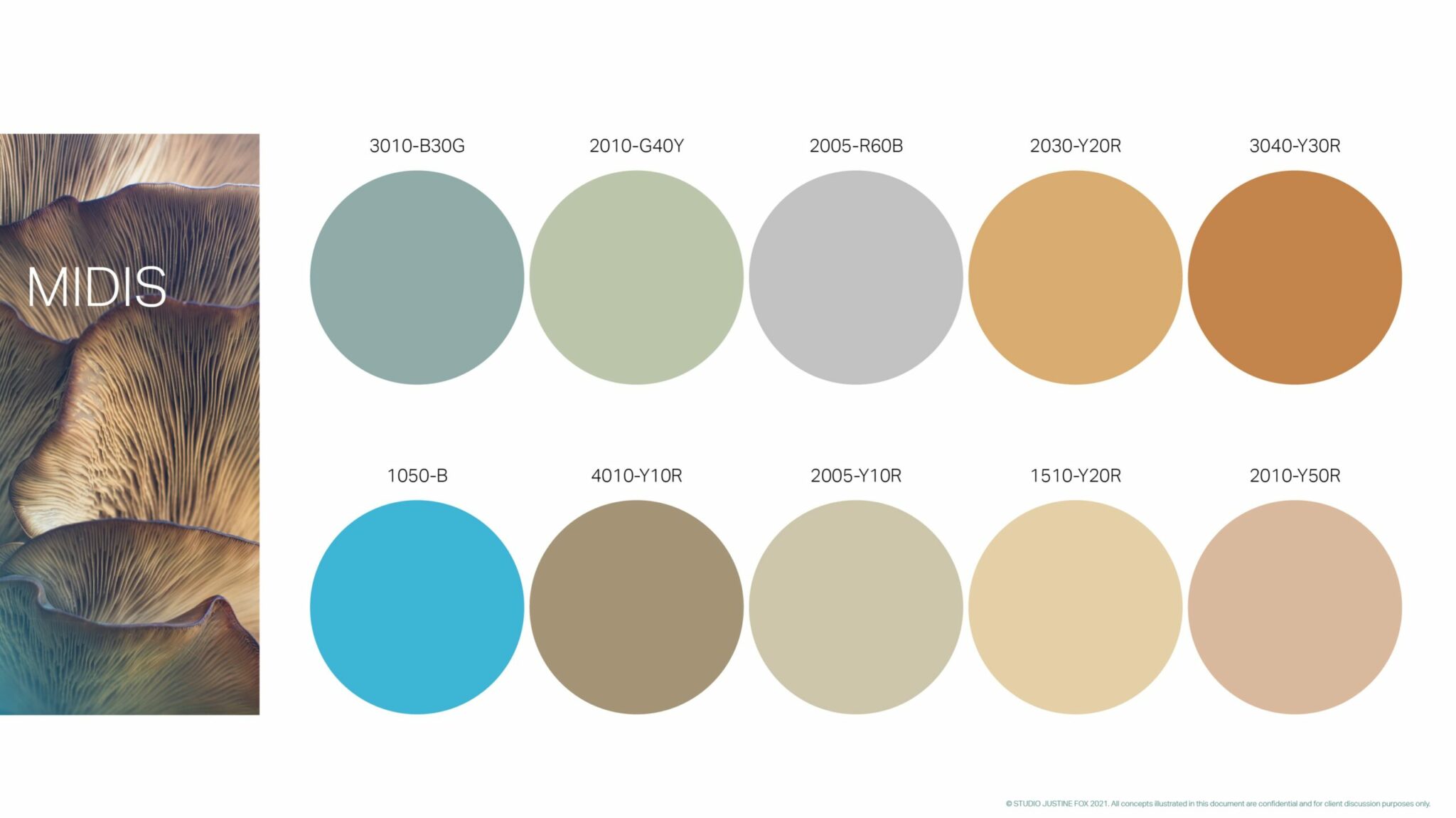
Mid tones
The colour direction for Mid tones takes inspiration from developments in bio-fabrication for the design industry. Key materials including Mycelium and Algae are explored, uncovering a plethora of softly comforting coloured naturals.
Light touch
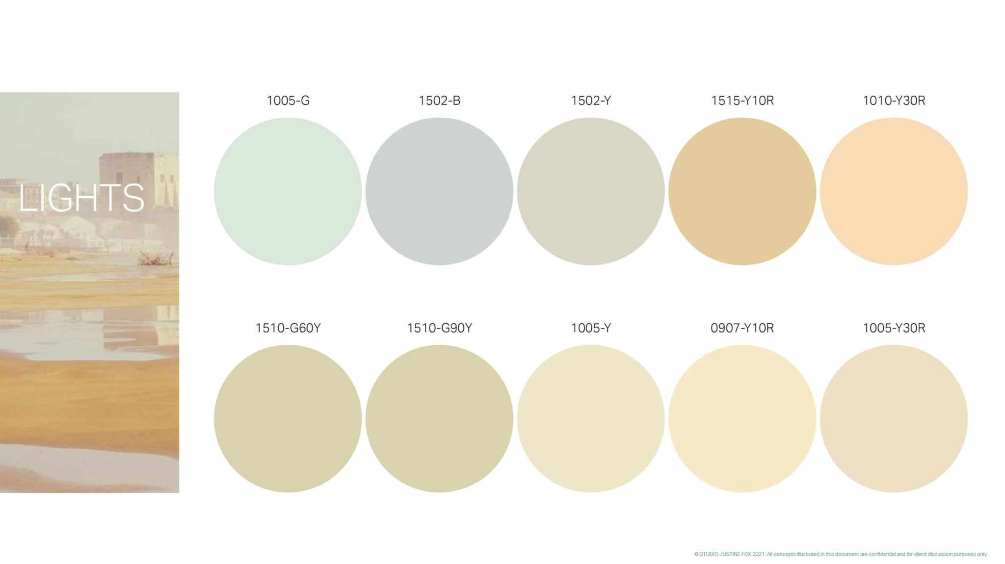
For the Lights inspiration came from the luxury end of the hospitality and residential markets, taking flooring to tinted neutrals with the quality to reflect daylight. Colour pointers play in warm gentle contrast, balancing hazy minks and golden sands to create a magical relaxed palette.
Focusing on lighter more illuminating tints not only creates a sense of spaciousness and openness to design, but psychologically lifts our mood bringing a sense of clarity and peace. The soft undertones through this palette add a calming welcome to the colours, giving hospitality a feeling of genuine friendliness and enhanced positivity.
The Culmination
And so, we’re pleased to present Serenity; look out for fresh new axminster collections designed in this palette in both our Rapide suite of designs, developed for super-swift turnaround, as well as designs in our Ready to Weave offer which allow semi-bespoke flexibility in that you can recolour the designs within the palette to create a carpet tuned to your interior scheme
Want to learn more about our design inspiration for this piece of work, or discuss your own design ideas? We’d be pleased to hear from you. Get in touch!