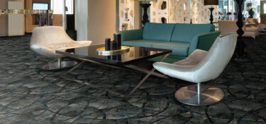
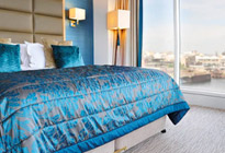
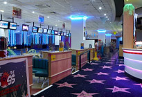
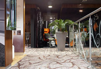
In Stock and On Stream
Key price, quick turnaround carpets, all constructed in industry gold-standard 80% wool, 20% nylon yarn.
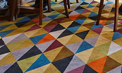
Ready to Weave
Expansive designs ready in 4 weeks. These collections are recolourable within our stock palettes
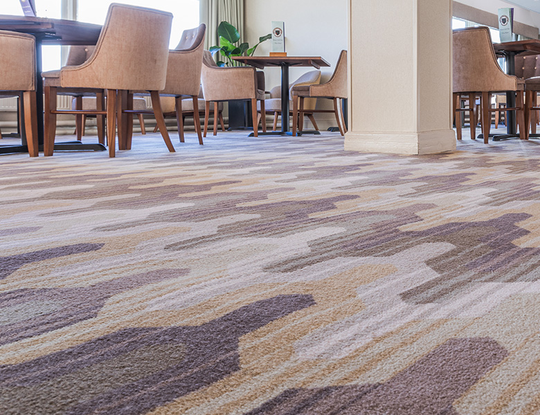
Tufted
Key price, quick turnaround carpets, all constructed in industry gold-standard 80% wool, 20% nylon yarn.
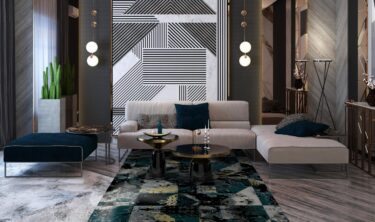
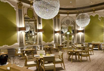
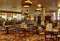
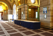
Bespoke Carpet
Work with our studio to create a unique carpet to your exact brief with custom colours and quality
Vignette Rugs
Contemporary, commercial rugs woven in enduring axminster.
Kit Kemp Hand Tufted Rugs
Exquisite quality, 100% wool, hand-tufted rugs in a suite of boho-chic designs.


In Stock and On Stream
Key price, quick turnaround carpets, all constructed in industry gold-standard 80% wool, 20% nylon yarn.
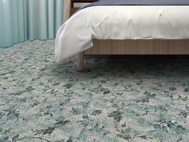
Ready to Weave
Expansive designs ready in 4 weeks. These collections are recolourable within our stock palettes
Bespoke Carpet
Work with our studio to create a unique carpet to your exact brief with custom colours and quality
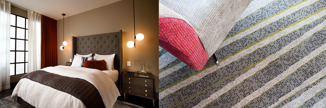
Printed Carpet
Printing the design onto the carpet offers a wealth of opportunity for refined, large-scale design, keenly priced for guest bedrooms and other lower-traffic areas.
Vignette Rugs
Contemporary, commercial rugs woven in enduring axminster.
Kit Kemp Hand Tufted Rugs
Exquisite quality, 100% wool, hand-tufted rugs in a suite of boho-chic designs.

Considering Colour: Individualisation
- News


Individualisation is a mega trend affecting a huge impact on the way we want to live. From homes, to work and our leisure time, the consumer need for self-expression, of feeling unique is driving brand and design communities. What does this mean for hospitality design?
Firstly, is how the brand tells its own story. Successful brands build loyalty through honesty in their culture, their products and the experience they offer. This is what sets them apart from others. Social media captures micro moments that peak interest, but within hospitality the consumer goes through many touch points that need to seamlessly link, creating a cohesive dialogue.
Colour, texture and scent directions are designed with brand in mind, as though for an individual client. This framework connects emotionally driven marketing communication with the sensorial communication of the interior designer. Carpeting has an incredible capacity for subtlety in creating subconscious brand reassurance through an environment. The process of an expert designer mixing complex colour through tufts has amazing possibilities for diverse visual tactility that act as a foundation to a scheme.
Another manifestation of the Individualisation movement being felt particularly through the boutique market is that of characterising rooms. This is brilliant on many levels, but especially within this context in the creation of a sense of home. The global nomad consumer with their extensive work travel needs to instantly identify with a space and we can encourage that personal imprint through colour.
Colour expression is internally motivated by facets of a core brand personality in the same way that we all reflect different aspects of ourselves dependent on mood. Ideally design should venture further to embrace the functionality of a room be it hotel co-working, socialising, dining or resting. Changing just a few elements in hue, value or proportion within the colour design of carpeting, can radically alter the sensory perception of a space still keeping visual references to the building as a whole.
Experience travel has risen against the falling tide of consumer spending on material goods driving our final mention of the Individualisation of the hospitality industry. Specifically designed to evoke a sense of location or appeal to the enthusiastic hobbyist, chain hoteliers are popping up with immersive environments that redefine visions of travel accommodation. Colour plays a significant role in delivering the overall visceral adventure especially when we play on ideas from cultural symbolism where we recognise references on a subliminal level.
The consumer wants to feel a sense of belonging in that place and in that moment, the intangibility of that experience is enhanced by the tangible surfaces around them.
Understanding artisanal processes in colour and material development unique to a region or activity and weaving that in with the creativity of the modern social protagonists gives meaning to interior design elements.
Individualism gives hospitality brands the reason for consumers to build a unique relationship with them. Through considered use of colour, proportion and texture you give people a sense of place and understanding that makes them feel instantly reassured and more eager to visit again.
Left: West Elm Hotels westelmhotels.com West Elm continue their brand ethos to bring together community-minded, design-focused consumers in their new hotel partnership with DKK. With 6 locations carefully selected, each will bring an ultra local experience to the traveller through their decor and service.
Right: Wilton Carpets at Inn On The Square, Cumbria. Inn On The Square retains its unique organic design connections in modern styling through touches of lichen on a zinc toned base.
Left: Wilton Carpets at Boclair House, Glasgow. The Art Nouveau spirit of the original building is returned with a sense of regional positioning in luxurious deep tones.
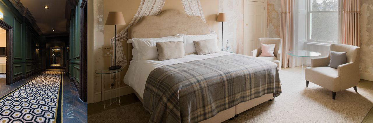
Right: No15 Great Pulteney, Bath no15greatpulteney.co.uk No15 Great Pulteney brings individual flavour to each of its rooms and suites that enhance the local experience by drawing on the talents of local interior designers and artists.
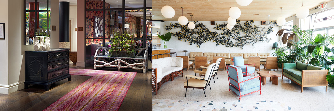
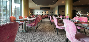
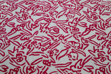
Left: Kit Kemp Collection for Wilton Carpets at Soho Hotel, London. The red colourway in Batik attracts the eye directing the visitor through this carefully curated reception.
Right: The Drifter Hotel, New Orleans. Image courtesy of Design Hotels™. Bookings via www.designhotels.com. A confident use of light neutrals creates a freshly relaxed bar area that shows its independence through statement red and blue contrast seating.
![]()
Justine Fox specialises in business focused colour strategies and the development of future aesthetic development programs. Her diverse international client list ranges from brand & packaging, consumer electronics, coatings, flooring, industrial design, eyewear, art and architectural materials.
Over the last 12 years in this industry, Justine’s focus and curiosity of our relationship with colour has continued to grow. Her consultancy, Material Colour goes beyond trend forecasting to integrate the principles of applied colour psychology and evolving colour technologies to effectively communicate her clients’ brand values and create emotional connections with the consumer through their products and marketing.
Justine is an experienced speaker on colour design having held seminars and hosted workshops both privately and at some of the most exciting design exhibitions around the world. She’s a member of the Colour Group GB and a lead advisory expert for the NCS Global Trend Program.