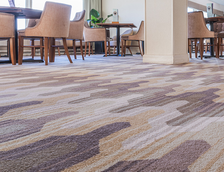
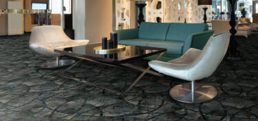
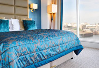
In Stock and On Stream
Key price, quick turnaround carpets, all constructed in industry gold-standard 80% wool, 20% nylon yarn.
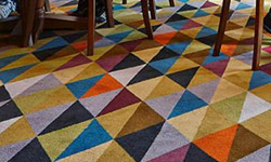
Ready to Weave
Expansive designs ready in 4 weeks. These collections are recolourable within our stock palettes
Tufted
Key price, quick turnaround carpets, all constructed in industry gold-standard 80% wool, 20% nylon yarn.
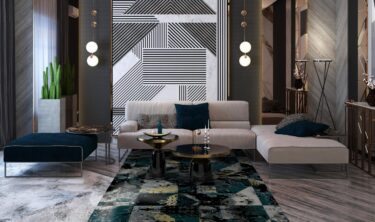
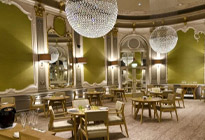
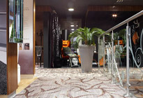
Bespoke Carpet
Work with our studio to create a unique carpet to your exact brief with custom colours and quality
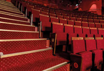
Vignette Rugs
Contemporary, commercial rugs woven in enduring axminster.
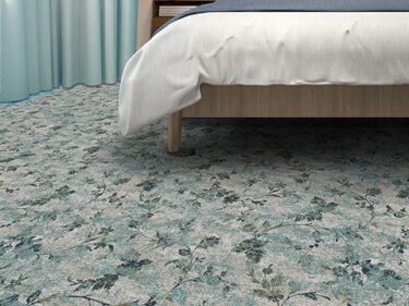
Kit Kemp Hand Tufted Rugs
Exquisite quality, 100% wool, hand-tufted rugs in a suite of boho-chic designs.


In Stock and On Stream
Key price, quick turnaround carpets, all constructed in industry gold-standard 80% wool, 20% nylon yarn.
Ready to Weave
Expansive designs ready in 4 weeks. These collections are recolourable within our stock palettes
Bespoke Carpet
Work with our studio to create a unique carpet to your exact brief with custom colours and quality
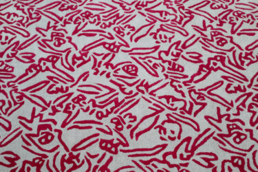
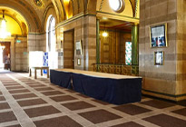
Printed Carpet
Printing the design onto the carpet offers a wealth of opportunity for refined, large-scale design, keenly priced for guest bedrooms and other lower-traffic areas.
Vignette Rugs
Contemporary, commercial rugs woven in enduring axminster.
Kit Kemp Hand Tufted Rugs
Exquisite quality, 100% wool, hand-tufted rugs in a suite of boho-chic designs.

Considering Colour: The Beginnings
- News


Featured Image – Credit: Kimpton De Witt Amsterdam and the design was overseen by Kimpton’s Global SVP of Design & Creative Director, Ave Bradley.
As London Design Festival draws to a close for another year, it’s the perfect time to build on the inspiration of this fantastic event and introduce our new quarterly blog series Considering Colour. Wilton Carpets and I have a shared love of colour and the evocative nature of its nuances within design which has brought us together for this project. Our curiosity is at the core of our creativity and colour is such an exciting area of research and development.
Understanding that colour doesn’t exist in the abstract, it’s a sensation and needs our interaction to be, should be at the forefront of everyone’s design processes. I’m sure that you remember the basics of school science but just in case, here’s a quick recap.
Colour is light and light is a tiny part of the electromagnetic spectrum and actually the only part that is visible. The electromagnetic spectrum is a series of wave frequencies and includes microwaves, x-rays and gamma rays which we all know have a physical effect on us. In terms of colour, when light hits an object it absorbs all the waves compatible with its atomic structure and spits back the rest. When these reject light waves hit our eye, the receptors at the back sort it all out and send a message up to our brains. Some goes to the visual cortex which we then see as colour and some ends up in our hypothalamus.
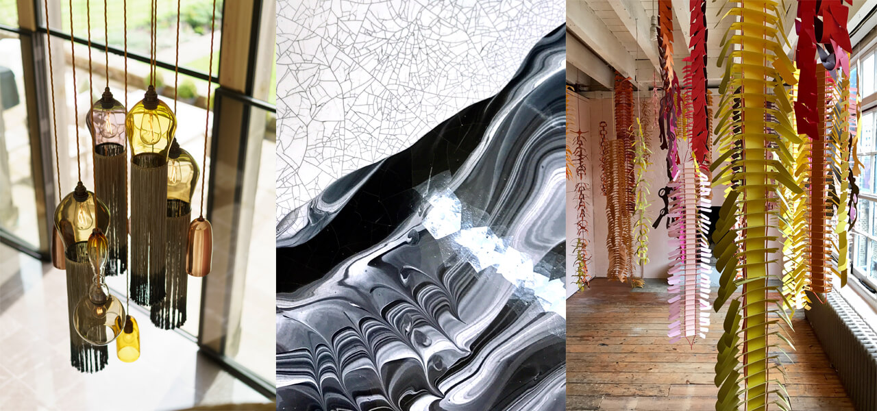
From left to right: 1) Credit: Tiger Lily, Curiousa & Curiousa www.curiousa.co.uk 2) Credit: Detail of Fosco Table by Elisa Strozyk www.pulpoproducts.com Image: Justine Fox 3) Credit: Bethan Laura Wood X One Gallery www.roomone.com Image: Justine Fox
What’s amazing about the hypothalamus is that it controls so many of our bodily functions like the circadian rhythm, and studies have found that certain light waves can supress or activate many of these. Now colour science, like many others, is constantly evolving as we discover new aspects like non-visual receptors to light waves (oh yes, they are there) and our understanding deepens. It’s these exciting developments that seem to indicate that colour is not purely subjective but is also a biological response that can be anticipated to a certain extent like any other.
So how does this explain one person preferring blue and the other preferring red? Well it doesn’t because on a personal level we have cultural and experiential associations that also come in to play, but what studies have shown is that even if we can’t agree on a single colour, we can agree that we prefer harmony over discord in colour combinations.
When it comes to hospitality design and brand communication, this opens up a wonderful toolbox to speak directly to your customers through their surroundings. In a recent interview, Mark Gandy, Global Brand Director at Blue Marlin explained that ‘The biggest difference between brand success and failure can be traced back to whether the innovation was in line with the company values.’ Consider your brand, are you fun and playful, calming and considered, creative and expressive or refined and sleek? You can easily choose your colours that reflect this these qualities by being warm and light, cool and tonal, warm and intense or cold and sharp. By defining the types of colours that support your brand, you can really connect with your audience creating an honest rapport.
Trend still plays a significant role in creating successful hospitality environments. We’re not saying however that a putty brown like Heart Wood should be at the centre of all colour schemes for 2018 just because Dulux Akzo Nobel announces it as their Colour of The Year. What’s more fascinating is the language they use around this tone. It’s a real insight into the minds of the consumer and speaks about their longing for a place of safety, a sense of personalisation and in fact of home wherever they are. Capture this essence while being true to your brand through colour and you’ll be on to a winner.
Through this series of Considering Colour with Material Colour and Wilton Carpets, we really want to take you on a journey through the intelligent use of colour that’s insightful, inspirational and fun. We’d like to challenge how you see colour within your environment. This is just the beginning.
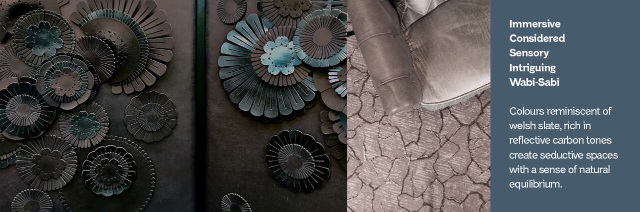
From left to right: 1) Credit: Detail of screen by Genevieve Bennett www.genevievebennett.com Image: Justine Fox 2) Lodore Falls, Credit: Wilton Carpets
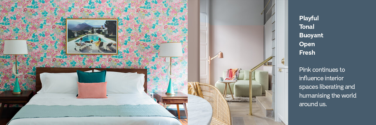
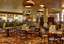
From left to right: 1) Credit: Palm Springs Room, Dwell Hotel www.thedwellhotel.com 2) Credit: Eden Locke, Edinburgh www.lockeliving.com/eden-locke
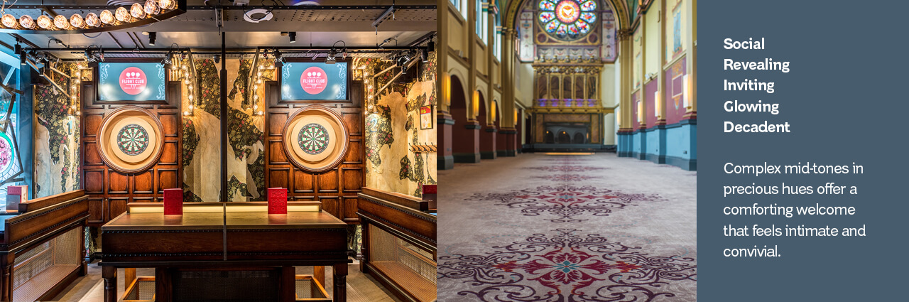
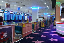
From left to right: 1) Credit: Flight Club Darts flightclubdarts.com 2) The Chapel at Beaumont Estate, Credit: Wilton Carpets
—
![]()
Justine Fox specialises in business focused colour strategies and the development of future aesthetic development programs. Her diverse international client list ranges from brand & packaging, consumer electronics, coatings, flooring, industrial design, eyewear, art and architectural materials.
Over the last 12 years in this industry, Justine’s focus and curiosity of our relationship with colour has continued to grow. Her consultancy, Material Colour goes beyond trend forecasting to integrate the principles of applied colour psychology and evolving colour technologies to effectively communicate her clients’ brand values and create emotional connections with the consumer through their products and marketing.
Justine is an experienced speaker on colour design having held seminars and hosted workshops both privately and at some of the most exciting design exhibitions around the world. She’s a member of the Colour Group GB and a lead advisory expert for the NCS Global Trend Program.